You often wondered as a website owner, why the designer left the space blank? Why can’t he fill this space as well? Believe it or not, that blank space can play a significant role in the entire layout of the web page. White space is one of the most flouted and underutilized elements that can make a web layout astoundingly beautiful and smooth. Many of you think of white space as an unused space of a website real estate. However, it is much more than that.
Defending white space in web design concepts can be difficult but it is worth fighting for. It can make the web design easier to understand, speedier to deduce and as a result, more cost-effective. Even though white space is a customary and researched asset that can help turn chaotic websites into smooth conversion engines, arguing in favor of something which cannot be seen is a challenge.
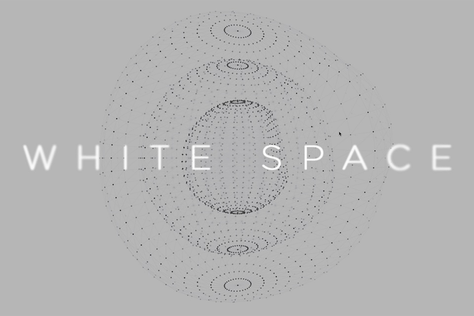
Why Is White Space So Crucial?
Most of the designer believes that white space is a negative space; it is the portion of the page left intact. Some of them often refer to the space between graphics, margin, and gutter. And honestly, they are quite true (in the aspect of semantics or technology). As a Web designer, I consider white space as one of an integral part of web designing, just like a building block. I consider it as a space between columns, between the line of type or figures that provide a sort of visual breathing room for the eyes of users.
White space is important for a good reason. A designer needs to deliver a layout that gives convenience to a user to read the content easily & for a long period of time. So, with the correct amount of white space, one can transform a design and give websites lots of advantages over others.
Advantages Of Using Whitespace
1. White Space Speed Up Interface
White space is a key to get the message through and to make visitors act on it. It’s a matter of clarity and motivation. It should be clear to the visitor where he wants to go.
It has shown in the past researchers that a confused user is less keen to respond in favor of the website owner. A user is deemed to scan the website not read it entirely. So, if a user is presented with fewer options and ample space, it can slow him down to stay on your web page for longer durations without creating any distraction.
2. Guide Users Around The Page
This point can closely resemble the above-given point. Using white space you can actually steer your visitor to visit the desired sections of your web page. Stuffing around objects frames them and creating a perfect object of attraction for the users. For example, first to a header, on a piece of copy and from there to CTAs (Call to Actions).
3. White Space Can Highlight Your CTA
Commonly users tend to ignore banners and graphics that look like a banner. So, you got to make links and buttons stand out to ensure that visitors don’t rebuff them too. White Space is perfect for this task. Objects and copy framed by empty space are stressed and very eye-catching for the users.
4. Chaotic Means Chaotic
There is an adequate difference between order and amount. Most of the website has pixel-perfect layouts and margins that could shame even the ruler, yet leaves the visitors puzzled.
An unblemished visual structure is always required, but crucial to quick understanding is curbed. Limiting the options is as important as aligning them to grids. With the growing amount of mobile users, this trend is growing fast. Even the upshot of fewer options is often faster load times.
5. The See-Saw Effect
You need to understand the psyche of a visitor if you are considering whether or not to add more elements to a web page. In my opinion, it will be astute to consider a user like someone who wants to see lesser options. This can actually result in an average time a visitor spent on a page.
There are risks of distraction and confusion if you provide a larger number of options to a visitor. This might result in more time spent in scanning the page and less chance of making a visitor stay on your page. For this reason, the sidebar and banner can lead a visitor in leaving the page.
Empty space isn’t fresh air that lets the web page breathe – it’s dynamic space that makes the website healthier in every way. So if the aim is to make users take action, help them do so. They don’t need to see how it’s been accomplished, but they’ll appreciate you for doing it


No Comments